Kaap & Tein is a unique restaurant right in the middle of Zeedijk, a street in the old city centre of Amsterdam. When working over at Wood & Apples I had the pleasure of working on this project of setting this restaurant up from the very bottom. From the concepting with many brainstorms about the perfect name to the whole graphic identity as well as the interior design.
The location was our starting point: a beautiful old building with a small terrace that is split between rougher Zeedijk area and the chic Gelderse Kade. This split is what the whole concept was based on. The restaurant, the name and the identity are all split right down the middle. Kaap & Tein, written as Kaap / Tein in the logo shows the first sign of this split. As soon as you enter the restaurant, you understand the rest. There’s an entrance at both the Zeedijk as well as at Gelderse Kade and depending on which entrance you use, you’ll be met with a totally different vibe.
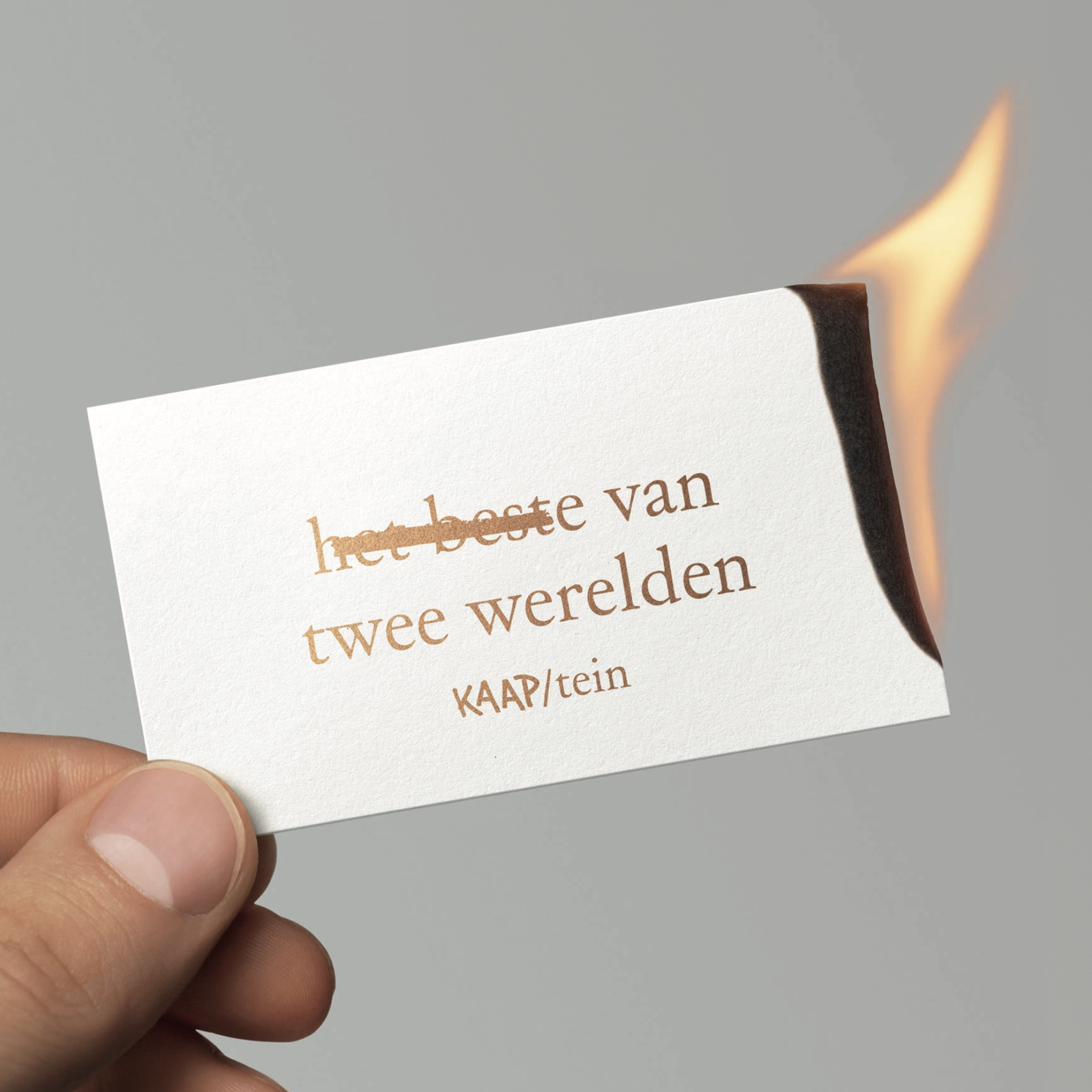
The sides literally show the dark and the lighter side of the buildings history, the best of both worlds. The Zeedijk side holds the bar area and terrace, and was painted almost completely black, up to the ceilings. In the middle of the restaurant you find this split where the blackness suddenly gets overtaken with white on the Gelderse Kade side.
When you enter you’re met with a choice. Do you prefer the white side with large windows and beautiful natural light, or the dark side with burnt edges and cozy seating. Visiting with a bigger group? Right on top of the split down the middle is a large table that’s in turn split down the middle, so with some shuffling you can sit on both sides in one night!


